Fashion Collections
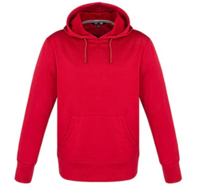
Polyester Pullover Hoodie- Export Products.
Rated 0 out of 5
In stock
SKU:
CanadaSportswear
Women’s Wrinkle-Free Long Sleeve Dress Shirts.
Rated 0 out of 5
Out of stock
Select options
This product has multiple variants. The options may be chosen on the product page
SKU:
Wrinkle
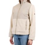
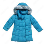
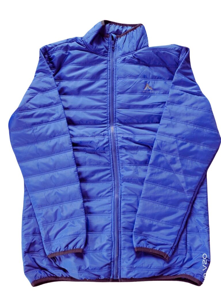
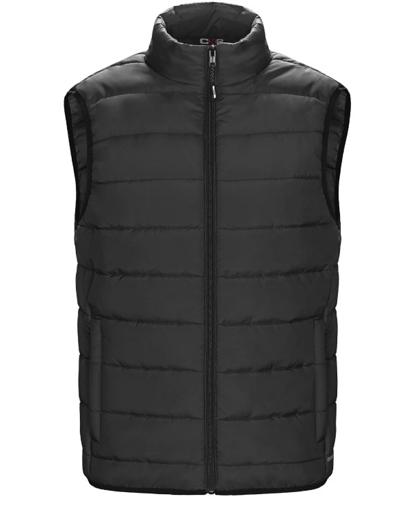
Puffer Jackets for men – Authentic Export Products in Bangladesh.
Rated 0 out of 5
In stock
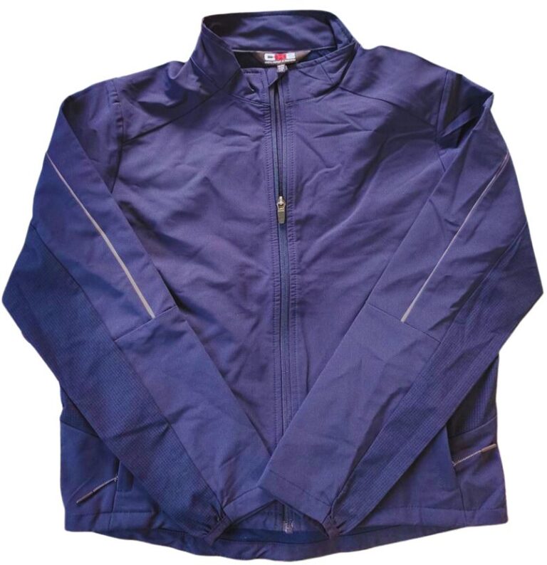
Men’s Fashionable formal half Jackets – Best Produces/Price in Bangladesh.
Rated 5.00 out of 5
(1)
In stock
SKU:
L0975-Y
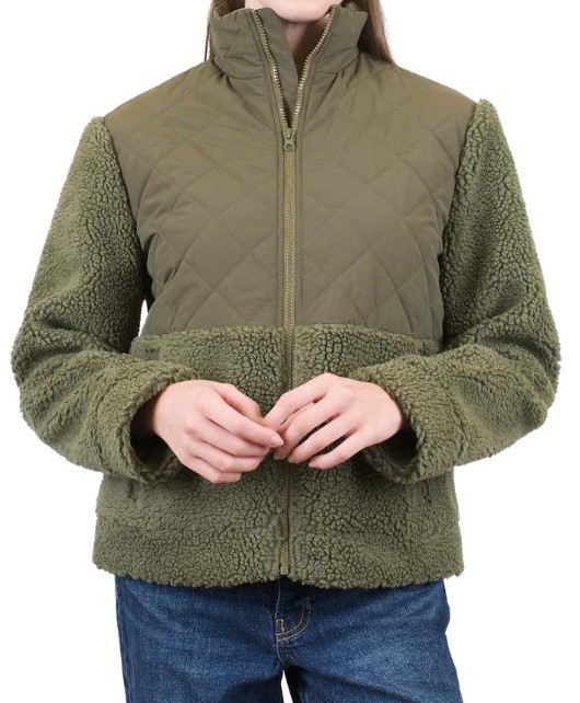
Newest additions to our Winter Collection – Jacket.
Rated 3.67 out of 5
(3)
In stock
SKU:
MW14184
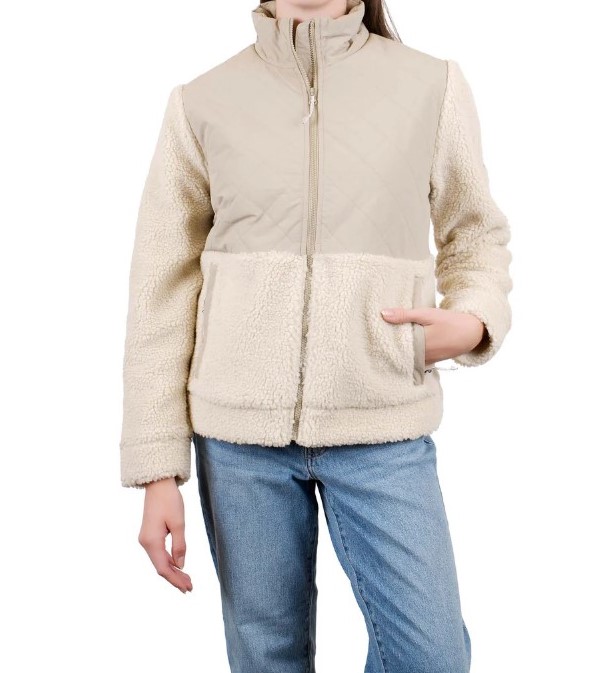
Newest additions to our Winter Collection – Jacket.
Rated 5.00 out of 5
(1)
In stock
SKU:
MW14184TK
New Arrivals
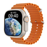
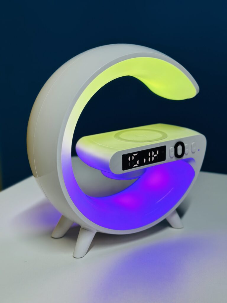
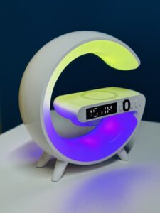
G63 Atmosphere RGB Light Bluetooth Speaker with Watch.
Rated 0 out of 5
In stock
SKU:
DS-RgbLight
Polyester Pullover Hoodie- Export Products.
Rated 0 out of 5
In stock
SKU:
CanadaSportswear
Puffer Jackets for men – Authentic Export Products in Bangladesh.
Rated 0 out of 5
In stock
Men’s Fashionable formal half Jackets – Best Produces/Price in Bangladesh.
Rated 5.00 out of 5
(1)
In stock
SKU:
L0975-Y
Fashion Shopping Event
Hurry and get discounts on all Fashoion up to 50%
0
days
00
hr
00
min
00
sc
Electronic Products
G63 Atmosphere RGB Light Bluetooth Speaker with Watch.
Rated 0 out of 5
In stock
SKU:
DS-RgbLight
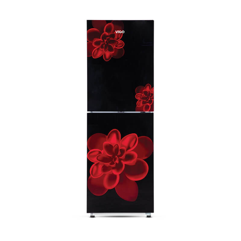
GD Refrigerator RE-196L-Red Rose Flower
Rated 0 out of 5
In stock
SKU:
892540
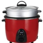
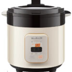
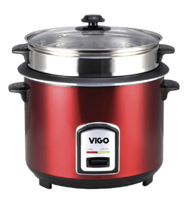
VIGO 3L Red Stainless Steel Rice Cooker – One-Pot (Model: 50-05).
Rated 5.00 out of 5
(1)
In stock
SKU:
824405
VIGO 3L Red Stainless Steel Rice Cooker (50-05)- with Dual Pot Function.
Rated 5.00 out of 5
(1)
In stock
SKU:
824587
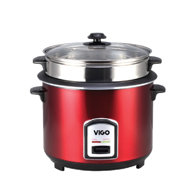
VIGO Rice Cooker 1.8L Red – One Pot, Easy Cooking for Small Families.
Rated 0 out of 5
In stock
SKU:
824493
VIGO Rice Cooker 1.8L Red Two Pot SS 40-06: The Perfect Blend of Style and Functionality.
Rated 0 out of 5
In stock
SKU:
874138
Organic Products
কৃষিতে ডিমের খোসার (Eggshell Powder) পাউডার: একটি অমূল্য প্রাকৃতিক সার
Rated 5.00 out of 5
(130)
In stock
SKU:
eggshell-powder
Vigo Electronics
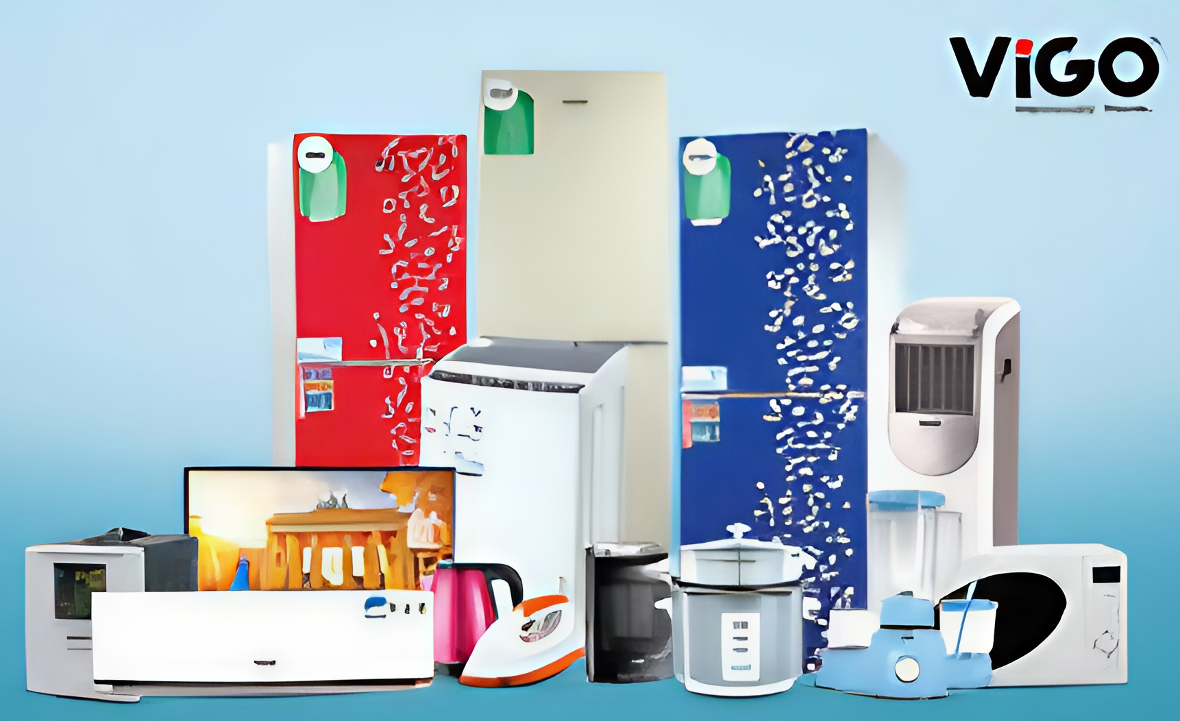
Vigo is concern of Pran-RFL Group. In the presence of many colors for every taste.

G63 Atmosphere RGB Light Bluetooth Speaker with Watch.
SKU:
DS-RgbLight
Rated 0 out of 5
In stock
Polyester Pullover Hoodie- Export Products.
SKU:
CanadaSportswear
Rated 0 out of 5
In stock
Recommended For You
কৃষিতে ডিমের খোসার (Eggshell Powder) পাউডার: একটি অমূল্য প্রাকৃতিক সার
Rated 5.00 out of 5
(130)
In stock
SKU:
eggshell-powder
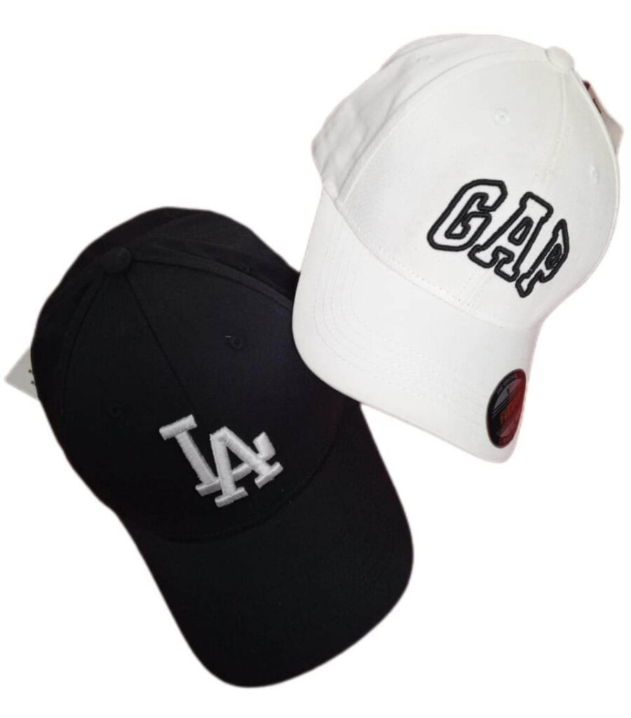
Export Quality Cap for Men and Women- Best Price in Bangladesh.
Rated 5.00 out of 5
(2)
In stock
SKU:
Cap-001
Newest additions to our Winter Collection – Jacket.
Rated 3.67 out of 5
(3)
In stock
SKU:
MW14184
Newest additions to our Winter Collection – Jacket.
Rated 5.00 out of 5
(1)
In stock
SKU:
MW14184TK
Men’s Fashionable formal half Jackets – Best Produces/Price in Bangladesh.
Rated 5.00 out of 5
(1)
In stock
SKU:
L0975-Y
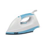
Vigo Electric Dry Iron (YPF-633) | 1000W Power, Non-Stick Soleplate, Fast & Efficient Ironing.
Rated 0 out of 5
In stock
Load more products
Loading...
Recently Viewed
Our Articles
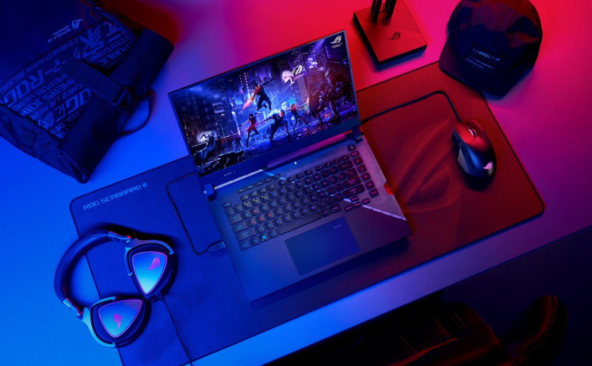
Best Gaming Laptop Models
At solmen va esser necessi far uniform grammatica, pronunciation e plu sommun paroles...
How to choose a HI-FI stereo system
Nullam dictum felis eu pede mollis pretium. Integer tincidunt. Cras dapibus. Vivamus elementum semper nisi...
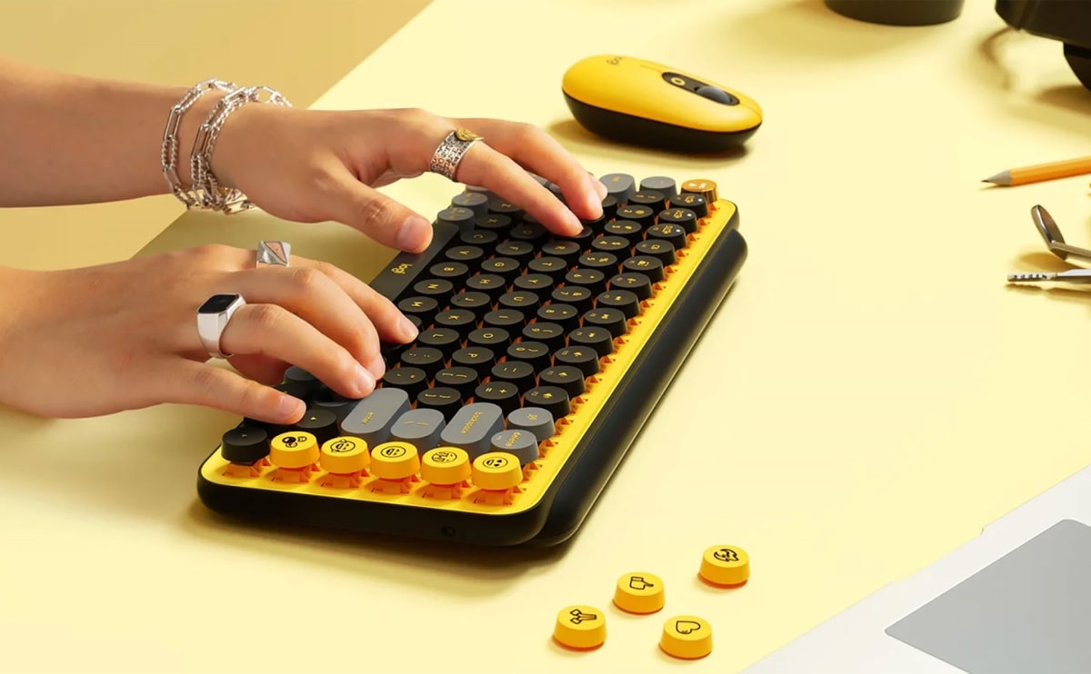
Logitech POP Keys
Maecenas nec odio et ante tincidunt tempus. Donec vitae sapien ut libero venenatis faucibus. Nullam quis ante. Etiam sit amet orci...
Cameras for Street Photography
At solmen va esser necessi far uniform grammatica, pronunciation e plu sommun paroles. Ma quande lingues coale...
3 Minimalist Desk Setups
At solmen va esser necessi far uniform grammatica, pronunciation e plu sommun paroles. Ma quande lingues coale...

